Design systems · Governance
A primitive-to-semantic token system and a formal governance process that took component consistency from a per-team guess to a shared standard, adopted across 15+ teams.
The brief
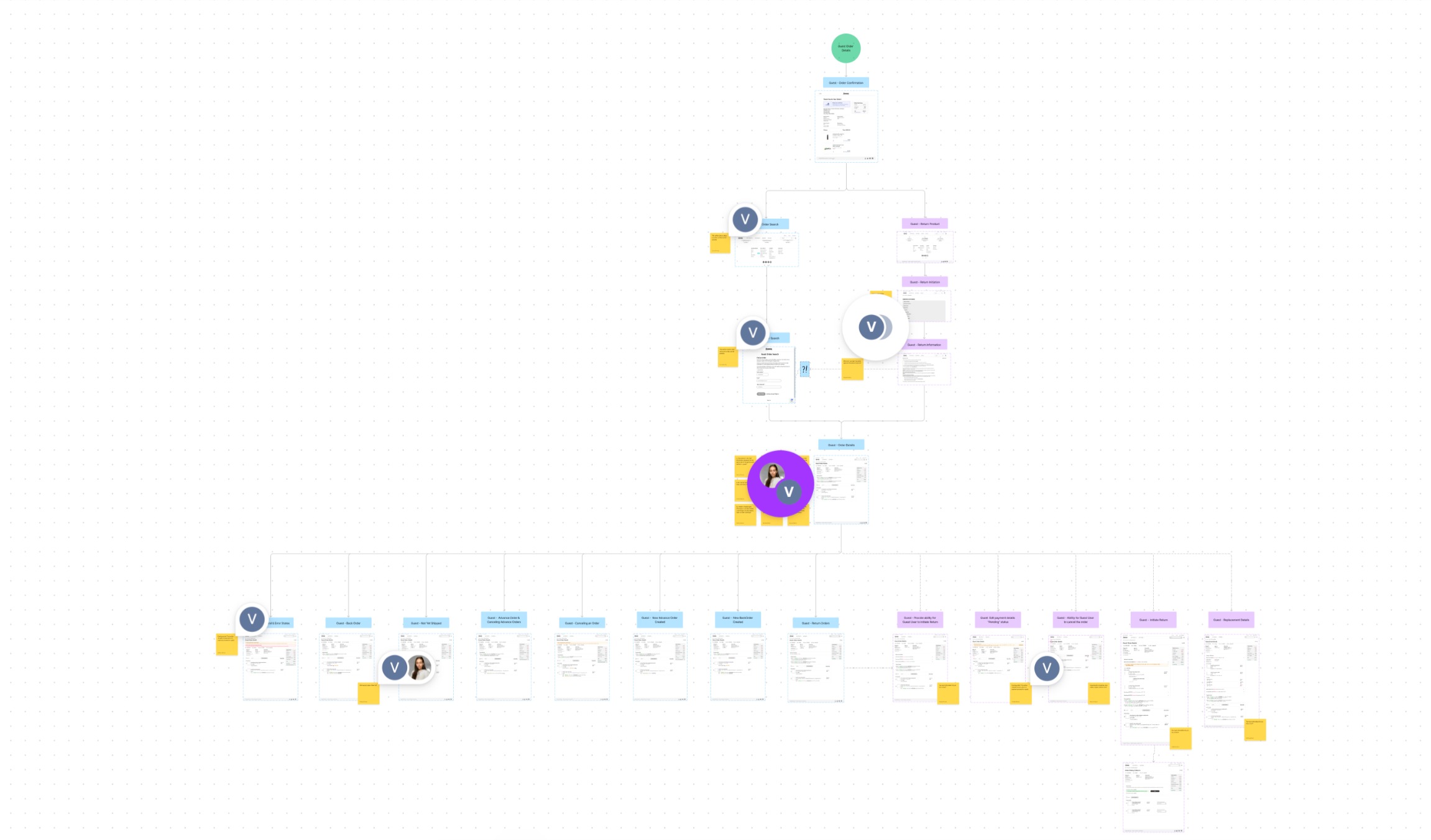
Amway's digital products span enterprise CRM, ordering, and discovery tools used by Amway Business Owners across North America and EMEA, built by agile product teams spread across Michigan, California, Singapore, and beyond. Each team had its own components, its own spacing decisions, its own color usage, because there was no single source of truth to work from.
The result wasn't just visual inconsistency. It was duplicated work: teams were quietly rebuilding the same patterns slightly differently, and nobody had a reliable way to know which version was current.
Approach
Fixing this needed more than a shared component library. It needed a structural layer underneath. I architected the system in two parts:
The raw values (color, spacing, type scale) defined once, with no product or brand meaning attached yet.
Built on top of the primitives, named for what they mean in product (e.g. color-action-primary, not blue-500), so a token's purpose stayed legible to any team using it, and updates could propagate without every team hunting down raw hex values.
That structure is what made the system extensible: a future rebrand or theme change could happen at the primitive layer without every team's components needing to be rebuilt by hand.
Governance
A token system only stays useful if it's maintained, so I put a formal governance process around it:
Versioning: every change to the system shipped as a tracked version, so teams could see exactly what changed and when.
Deprecation: outdated components and tokens were formally marked deprecated rather than silently left in place, with a clear timeline before removal.
Migration plans: each deprecation shipped with a concrete path for teams to move to the new pattern, reducing the drift that kills most design systems within a year.
In practice
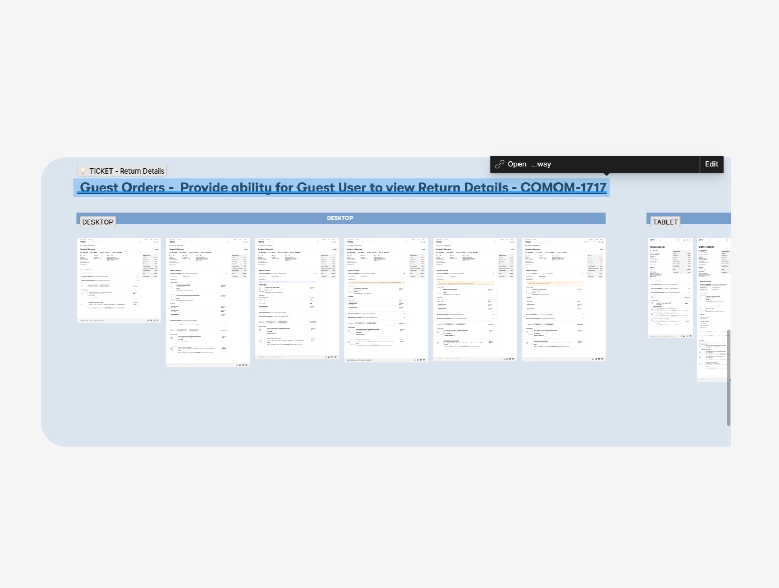
Every component was specified across screen dimensions, with the responsive behavior documented alongside the ticket, not left for engineering to interpret.
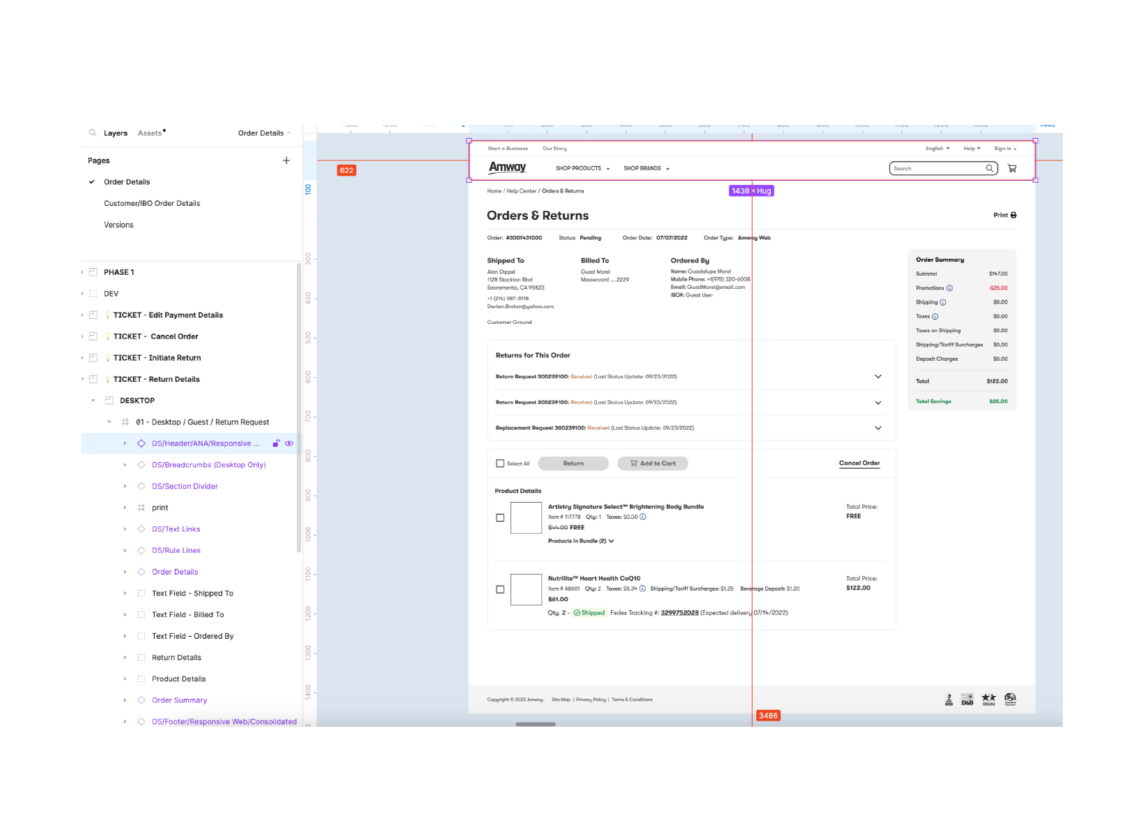
Figma components were organized top-to-bottom to mirror real component hierarchy, so engineers could find what they needed without a walkthrough.
Built and maintained Figma libraries with consistent typography and components, validated through usability testing rather than internal opinion alone.
Outcome
The token architecture and governance process were adopted across 15+ internal teams in North America and EMEA, replacing ad hoc, team-by-team component decisions with a single, versioned source of truth.