Rivet design system cover showing color tokens and component variants in Figma.
← All work

Design systems · Figma craft

Rivet: Design system & Figma component library

A token-first design system built from scratch in Figma for a focused-team SaaS product: primitive-to-semantic color architecture, light and dark theming, and a 14-component library with full variant coverage.

Role
Product Designer
Product
Rivet, SaaS
Scope
Tokens, styles, 14 components
Theming
Light & dark
Tools
Figma variables, Dev Mode

A product with no shared visual language yet

Rivet needed a foundation before it needed more screens. I built this as a from-scratch design system exercise, held to the same bar a production system has to clear: a real token architecture, not just a matching set of colors, and components built to survive change rather than one-off screens.

The goal wasn't a mood board. It was something an engineering team could actually build against: variables with correct scopes and Dev Mode code syntax, components with real variant logic and exposed properties, and a file organized the way a design system should be, not the way a single mockup file is.

A mark built from the same system it represents

Rather than bolt on a logo after the fact, I designed the mark using the same token constraints as everything else: bound to accent/default, drawn on the spacing and radius scale already in use. The result is a simple rivet motif, a ring and a center pin, that reads clearly at icon size and holds up as a full lockup, with a reversed version ready for dark surfaces.

Rivet logo lockup on a light background, icon mark plus wordmark.
Primary lockup, light surfaces.
Rivet logo lockup reversed for dark backgrounds, white wordmark on ink.
Reversed lockup, dark surfaces.

Primitives, then semantics, then components

Same structure I use on every token system: raw values first, meaning second, components last.

  • Primitive tokens

    Raw color scales, a spacing scale, and a radius scale, with scopes = [] so they're hidden from every property picker. Designers only ever touch the semantic layer above them.

  • Semantic tokens

    Role-based names aliasing those primitives, like bg/surface, text/secondary, accent/hover, mirrored across matching Light and Dark collections so switching themes is never a renaming exercise.

Only once the token layer held up did components start. Every fill, stroke, gap, padding, and radius is bound to a variable, never a hardcoded value.

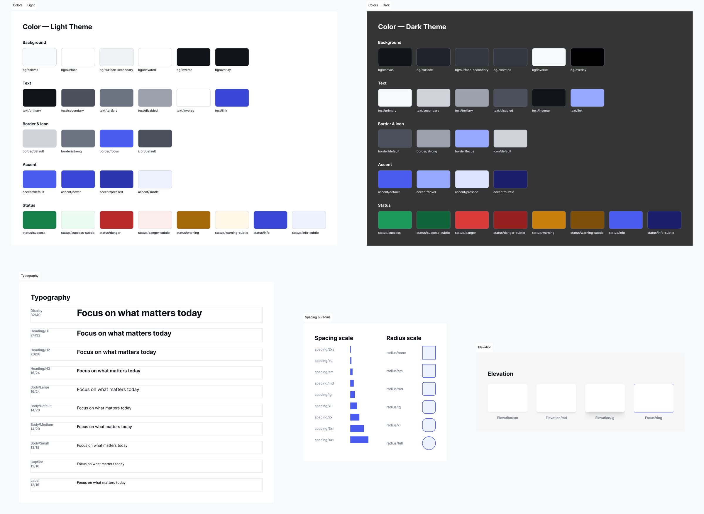
Rivet Figma foundations page showing light and dark color palettes, typography scale, spacing and radius scale, and elevation styles, all bound to variables.
Foundations page: color, type, spacing, and elevation, all token-bound.

Where the file had to hold up, not just look right

This project was as much about Figma technique as visual design. Every one of the 14 components uses combineAsVariants with a real variant matrix (Style × Size, State, Value), exposes component properties (text, boolean, and instance-swap) wired to the layers they actually control, and sits inside auto layout so nothing breaks when content changes.

  • 01

    Single-mode collections: the Figma plan this started on doesn't support multiple modes per collection, so light and dark theming lives in two parallel semantic collections with identical variable names, preserving the same alias architecture a two-mode collection would give.

  • 02

    Verified in phases: foundations were built and screenshot-checked before a single component was started, so nothing got built on unverified ground.

  • 03

    Knowing what to keep: after upgrading to a higher plan mid-project, the two-collection theming approach stayed exactly as designed. It was already sound, and re-deriving it would have meant undoing good work for no real gain.

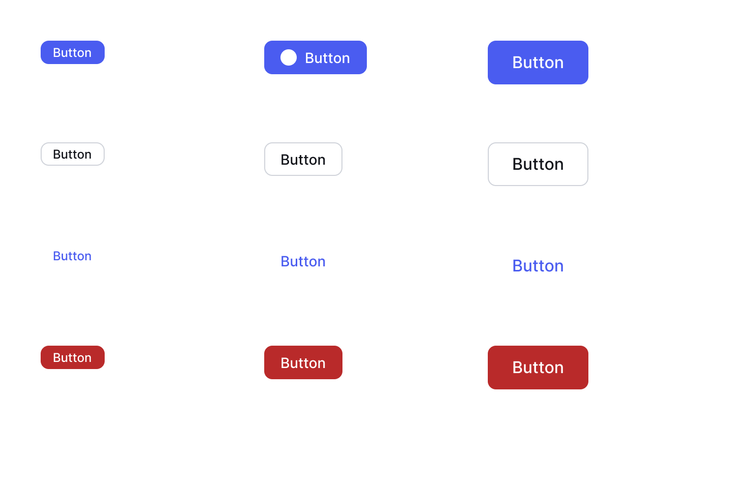
Rivet Button component set in Figma showing 12 variants across four styles and three sizes, each bound to semantic color tokens.
Button: 12 variants, Label and Show Icon properties exposed.
Rivet Modal component in Figma showing Small, Medium, and Large size variants with elevation styling bound to design tokens.
Modal: three size variants, elevation via effect styles.

A system, not a mockup

The result is a Figma file an engineering team could hand off from directly: tokens with real Dev Mode code syntax, components with editable properties instead of one-off frames, and a theming model that scales without a rebuild.

109
Tokens across 3 variable collections
14
Components, 84 variants total
2
Themes from one shared alias layer

Next case study

Amway: Design system & token architecture

View case study